Total Pageviews

Wednesday, December 7, 2011

You Are What You Eat Project

Investigate
The first thing I did after being assigned this project and reading the directions was begin to take note of every meal I ate, and the kinds of foods that those meals consisted of. I was absent the class period following the one when I had my project, so I had quite a selection of foods to choose from by the time I actually began. Another thing I did was look at examples of other food-face-collages. I payed attention to the ways in which the creators of each collage selected certain foods, and transformed others.

Plan
When I entered the planning phase of my project, I selected which foods I would use for the project, and which ones would be discarded. In my head, I arranged certain foods over my face to see which ones worked the best. I also looked at a few pages giving advice and information regarding the use of the transform tool. I also considered taking a pose to mix up the photo I would cover up with food, but thought against it. In the end, I finalized my ''pose" and list of foods to use.

Create
I finally began creating the project. I began by taking the picture. Instead of cropping out the background, I simply decided to fill the background with cheerios, a food from my list. I made my head out of an orange that I had shaped with the Warp tool. Bit by bit, I covered over my features from the actual picture with food items. I had trouble warping the body and neck, since they were larger and more complex pictures than any other. Interestingly, during the project I noticed that there was a bit less I could do to each shape than I could in Illustrator.

Evaluate
Looking back, I am for the most part satisfied with the outcome of my food collage. In my opinion, it is quite easy to discern my face from among all of the different food items. The items used also tell the story of my diet throughout the last weeks. The site that I looked at regarding the use of the transform tool ended up being useful, although I mainly just used the warp tool. In fact, all of the tutorials put up by the teacher taught me the basics of Photoshop, and built up my knowledge to eventually allow this project to work. The steps of the design cycle were helpful in completing this project in a smart way.

Final Product
Bibliography
-азин, еобхио. "Аппарат для изготовления сахарной ваты от Cotton Candy - сахарная вата у вас дома, всегда когда пожелаете | MagicMag.net." Магазин прикольных, необычных и оригинальных подарков Magicmag. Web. 07 Dec. 2011. <http://magicmag.net/catalog/137.html>.

- Dinah, Jean. "Craving Honey Nut Cheerios « A Small Drop of Ink." A Small Drop of Ink. 17 Mar. 2011. Web. 07 Dec. 2011. <http://dinahjean.wordpress.com/2011/03/17/craving-honey-nut-cheerios/>.
-Dinah, Jean. "Craving Honey Nut Cheerios « A Small Drop of Ink." A Small Drop of Ink. 17 Mar. 2011. Web. 07 Dec. 2011. <http://dinahjean.wordpress.com/2011/03/17/craving-honey-nut-cheerios/>.
- "The Gluten Free Lab » the Fourth of July Is Nigh." The Gluten Free Lab. Wordpress, 1 July 2011. Web. 07 Dec. 2011. <http://theglutenfreelab.com/2011/07/01/the-fourth-of-july-is-nigh/>.
- How Big Is My Potato? Web. 07 Dec. 2011. <http://www.howbigismypotato.com/>.
- James, Corey. "Bacon Cinnamon Rolls." Daily News on the World of Sweet, Sweet Bacon. Bacon Today. Web. 09 Dec. 2011. <http://bacontoday.com/bacon-cinnamon-rolls-o/>.
- McWorter, Elizabeth. "Flour Tortilla Recipe." My Home Cooking. My Home Cooking. Web. 07 Dec. 2011. <http://www.myhomecooking.net/mexican-food-recipes/flour-tortilla-recipe.htm>.
-Mortensen, Jens. "Best Pepperoni | The Best Frozen Pizza | Real Simple." Real Simple - Recipes, Organizing, Beauty, Fashion, Holidays. Lifestyle Group. Web. 07 Dec. 2011. <http://www.realsimple.com/food-recipes/shopping-storing/food/best-frozen-pizza-00000000041638/page3.html>.

- O'Brown, Niki. "Photoshop 101: How To Use The Free Transform Tool | Design Reviver." Design Reviver - Web Design Blog. Design Reviver, 29 July 2009. Web. 07 Dec. 2011. <http://designreviver.com/tutorials/photoshop-101-how-to-use-the-free-transform-tool/>.
-"Perfect Steaks, Cooking Perfect Steak, How to Cook Perfect Steaks, Steak Recipes, Recipes for Steak, Types of Steaks, Beef Recipes, Best Steak." What's Cooking America, Christmas Dinner Planning, Prime Rib Roast Dinner, Christmas Cookie Recipes. CSU Meat Sciences. Web. 07 Dec. 2011. <http://whatscookingamerica.net/Beef/CookingPerfectSteak.htm>.
-Southwick, David. "Labrat 1.5 Specification." Tall Hill Software. Web. 07 Dec. 2011. <http://www.tallhill.com/products/labrat/spec/labrat_spec.html>.
-Starr, Chris. "6 Words That Rhyme With 'Orange'" JoeCrazy.com Funny Articles and Funny Pictures. 30 July 2011. Web. 07 Dec. 2011. <http://www.joecrazy.com/6-words-rhyme-orange/>.

-Wegscheid, Shaun. "Multimedia." Technology. 30 Nov. 2011. Web. 07 Dec. 2011. <http://sw-multimedia.blogspot.com/search/label/multimedia>.

Monday, December 5, 2011

RGB and CMYK Color Models

A color model is a wheel of sorts that shows the values and hex codes for each of the RGB and CMYK colors. Here is the RGB model:


And here is the CMYK Model:


Note that Red in RGB and Cyan in CMYK were already done by the teacher, and have funny values because the teacher used Photoshop, not an online calculator.

Friday, November 18, 2011

RGB and CMYK

When it comes to images, there are two kinds of color used in most programs. These are known as RGB, and CMYK. I did not have to go too far down the list of resources on the teacher's blog to understand the meaning and differences of each color type.

RGB
RGB color stands for red, green, and blue. By using any combination of varying amounts of each of these three colors, you can literally make millions of different shades of color. RGB is known as additive. This means that the more color you add, the lighter the shade will be. Pure red, green or blue will always be the darkest shade you can get. As you blend all together, you eventually get the color white. RGB is often used for online images, since it's simpler than CMYK.


CMYK
CMYK color stands for cyan, magenta, yellow, and black. Unlike RGB, which uses values between 0 to 255 for each color, CMYK uses percentages from 0 to 100 for each color. By combining different percentages of cyan, magenta, and yellow, you can make vast amounts of different color. Further unlike RGB, CMYK is known as subtractive. This means that the more color of each type you add, the darker the image will get. With 100% of each color, you will get true black. For this reason, CMYK is the preferred color type for printing, and people often convert their work from RGB to CMYK if they weren't already doing so before printing their work.

Personally, I don't favor either color type over the other. Both have their advantages. RGB looks better in my opinion, and I prefer its 0-255 system over that of CMYK's, but the latter is more favorable when it comes to printing, so it is better in that sense.

Wednesday, November 16, 2011

Free Photoshop Tutorial

The teacher's blog said I needed to go out and find a simple Photoshop tutorial out on the internet. I googled it, and found an interesting and useful looking tutorial on how to replace colors in an image. I went from this:


To this:


Bibliography:

-Sardar, Roofie. "» How to Replace a Color in Photoshop Adobe Photoshop Tutorials | Photoshoplayer.com." Adobe Photoshop Tutorials | Photoshoplayer.com. Photoshop Layer, 7 July 2011. Web. 16 Nov. 2011. <http://www.photoshoplayer.com/beginner/how-to-replace-a-color-in-photoshop/>.

-Kratochvil, Petr. "Christmas Illustration Of A Christmas Tree With A Red Background And Stars | # 5679 | Freestockphotos.biz." Free Stock Photos. GSE-Media. Web. 16 Nov. 2011. <http://www.freestockphotos.biz/stockphoto/5679>.

Andy Warhol Style Human

Here is an Andy Warhol Mosaic Style Photoshop image of a random person.

Monday, November 14, 2011

Andy Warhol Style Kittens

Following a teacher tutorial, I created a mosaic-style image with the same kitten under different filters arranged in a square 9 times.

Original image from : Burrfoot, Tasselhoff. "A Cute Orange Kitten Isolated On A White Background | # 9343 | Freestockphotos.biz." Free Stock Photos. GSE-Media. Web. 14 Nov. 2011. <http://www.freestockphotos.biz/stockphoto/9343>

Another Similiar Tutorial

In this image, I simply follow the same directions I did with last photo, but this time with a distorted image of myself.

Thursday, November 10, 2011

First Photoshop Tutorial!!!

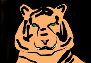
I completed my first tutorial for Photoshop today. I followed directions from the teacher's blog instead of from an actual tutorial sight like I usually do. I think it was a very good tutorial with clear directions. For the most part, I worked through it quickly, without getting stuck anywhere. I also got to learn about a few of the basic tools used in Photoshop. This is what I ended up with:


Original picture from:

-II, Brimac. "Close-up Of A Sumatran Tiger | # 9470 | Freestockphotos.biz." Free Stock Photos. GSE-Media. Web. 10 Nov. 2011. <http://www.freestockphotos.biz/stockphoto/9470>

Tuesday, November 8, 2011

Expiramenting With Photoshop

Today, I used Adobe Photoshop for the first time. My first impression when I saw the User Interface was that it reminded me a lot of Illustrator. It had a similar layout in terms of tool-bars and menus. I was confused at first, and had a hard time getting started. Most of the tools I tried to use responded with error messages, mentioning something about ''layers." Apparently, these "layers" are what Photoshop is all about, but I still don't get it. One tool I did know how to use was the Pen Tool. This one was simple: Just hold down the left mouse button and draw. I hope we star on some tutorials soon, so I can begin to understand this program.

Self-Evaluation of Illustrator Projects

Designing and Creating a Digital Manifestation of Yourself

 TOTAL-33
Criterion A-5
B-6
C-5
D-6
E-5
F-6


Collecting and Graphing Scientific Data


TOTAL-33

Criterion A-6

B-5

C-5

D -5

E -6

F-6

Monday, October 31, 2011

Illustrator Reflection

In my opinion, Adobe Illustrator is a very powerful program. There is so much you can do to one single drawing. It is especially useful because it works with vector images. These are useful because they are more easily scalable, and retain clarity. You can easily tell Illustrator is a professional program by the level of development put into it. It can also export and save images as many different file types. All in all, it is a very useful program that everyone should learn at some point in their life.

I feel like I am pretty good at using Adobe Illustrator at this point. After doing many tutorials and two projects of my own, I have had time to get better at it and learn many of its different features, although I have probably only scratched the surface of its capabilities. If I were given another project to do, I feel like I could do a pretty good job of it, since I know many of the basic and some intermediate tools offered by the program. I am especially good at the graphing tool, since one of my projects revolved around making a graph. For the most part, I'm pretty confident in my ability to use Illustrator.

Different File Types

There are many different file types out there. They are all special in their own ways. Some are more common than others. Each file type has its own strengths and weaknesses.

One of these is Adobe Illustrator Artwork (AI). It is a proprietary file format that was developed by Adobe systems. It can represent single page vector-based drawings, and uses a .ai file extension.

Another is JPEG, which stands for Joint Photographic Experts Group. It is a very popular method lossy compression for digital photography. This means the user can choose how much quality is lost when saving or exporting an image. The maximum size is 65535x65535 pixels. JPEG is used for bitmapped images. It uses a .jpg or .jpeg file extension.

Another file type is Portable Network Graphics (PNG). It is a bitmapped image format that employs lossless data compression. It was created to improve and replace the GIF format. It uses a .png file extension.

A fourth kind of file format is Scalable Vector Graphics (SVG). It describes ways to format 2-D vector graphics, both animated and still. It was developed by W3C in 1999. Its uses a .svg or .svgz file extension.

Some believe that it would be easier and simpler to have one single file format that would apply to all image file. Maybe it could be name .pic or . img. This might make saving or viewing files more easy to learn. A downside to this is that you would lose versatility, and interacting with files would become too boring, simple, and easy.

We most likely use different file formats because with only one file format, you might not be able to do everything you want with a file. Certain file formats work better in some ways, and others work well in others. If you only had one file format, it might not be able to specialize in one way.

Thursday, October 27, 2011

Designing and Creating a Digital Manifestation of Yourself

Investigate
The first thing I did for this project was look at some other examples of people drawn in Illustrator. After considering what I had seen, I realized that simply making a humanoid avatar to represent myself was boring, and overdone. I decided to instead represent myself through an interest of mine. One thing I am interested in is football. A football also quite clearly resembles a persons head. I made the decision to portray myself with a football for a head, and give the football humanoid facial features.

Plan
I made a quick sketch on paper of what my avatar would look like. After tweaking the design a bit, I was satisfied. I reviewed my old tutorials and work I had already done on Illustrator to refresh some of the tools that I might end up using for the actual project. I looked at myself and took note of some of the defining features that added character and made myself unique. I could also include that on the football to make it look more like me.

Create
I finally got onto Adobe Illustrator and began creating the avatar. The head (football) was made using the ellipse tool, as were the eyes and hands. Almost everything else was made with basic rectangle shapes, then altered to the required shape using the direct selection tool. The actual football was the first thing I did. I put most of my effort one the football, and also made it the focal point of the avatar. The point of this was to symbolize the magnitude of my interest. The body was made later, with rectangle shape. I added the Nike logo to the shoes and shirt as an afterthought, just to make it a bit more interesting. I finally added a radial gradient to the football to give it a bit of depth.

Evaluate
Looking back, I think my digital manifestation turned out quite well. It is easy to discern a human face in the football, and the large eyebrows, nose, and braces make it look more like me instead of just any other person. The tutorials I made at the beginning of the Illustrator unit ended up being quite useful to me. They taught me the basics of the software, along with a few more advanced tricks I employed in the final project. By following through the different steps of the design cycle, I was able to approach the project in a logical and intelligent manner.


Bibliography
-Akhter, Aquil. "40 Cartoon Character Illustration Tutorials - Smashing Magazine." Smashing Magazine - For Professional Web Designers and Developers. Team 23 Webdesign, 16 Apr. 2009. Web. 27 Oct. 2011. <http://www.smashingmagazine.com/2009/04/16/40-cartoon-character-illustration-tutorials/>.
 -"Vector Illustration: 60+ Illustrator Tutorials, Tips and Best Practices - Noupe." Noupe - The Curious Side of Smashing Magazine. Team 23 Webdesign, 14 July 2008. Web. 27 Oct. 2011. <http://www.noupe.com/tutorial/vector-illustration-60-illustrator-tutorials-tips-and-best-practices.html>.
- "Vector Sports,free Downloads Vector,Basketball,Football Download Free Vector,PSD,FLASH,JPG--www.fordesigner.com." Download Free Vector,PSD,FLASH,JPG--www.fordesigner.com. Web. 27 Oct. 2011. <http://www.fordesigner.com/maps_list/list15-1.htm>.

Friday, October 21, 2011

Collecting and Graphing Scientific Data

Investigate
The first thing I did was brainstorm different ideas on what information to collect and graph. I decided to investigate whether or not a runningback's height effected his average yards per carry. I went to the NFL website to collect my information from 31 different runningbacks of varying heights. I double checked my information of the ESPN website and at Sporting News too. I also watched a tutorial on how to use the graphing tool on Adobe Illustrator.

Plan
Once I had all of my data collected and organized, I began to think of how to present it. I decided a bar graph was most appropriate to display and compare the data. I drew a draft on paper in order to form a picture of what I wanted my final graph on the program to look like. I also analyzed my data and eliminated one runningback whose height was 6'4, which was a bit of an outlier.

Create
 I opened up Adobe Illustrator and selected the Column Graph Tool. I used it to create the basic shape of my graph. Following the tutorial, I plugged in all of my values in the places they belonged, then created the graph. I used the Text Tool to label my axes, and create a title for the graph. I was originally going to leave it at that, but I decided it looked too boring. I gave the labels exciting, fun fonts, and made the bars 3-D. I gave each bar a different color, and applied a gradient effect to each one. Finally, I re-sized the graph in order to make it fit onto the artboard.

Evaluate
I am satisfied with the final product of my efforts. The online sources I used were helpful, and I would not have easily figured out the graphing tool without the tutorial. Input from my teacher and peers also influenced the look of my graph. I believe it presents information clearly and effectively. The design cycle was useful, and helped me approach the project in a logical and convenient way..

Bibliography
 "2010 NFL Player Rushing Stats - National Football League - ESPN." ESPN: The Worldwide Leader In Sports. Ed. Elias Sports Bureau. The, 2 Jan. 2011. Web. 21 Oct. 2011. <http://espn.go.com/nfl/statistics/player/_/stat/rushing/sort/rushingYards/year/2010/seasontype/2>.

 -Coffin, Drew. "Create Bar Graphs in Adobe Illustrator CS4 | Ecommerce Developer." Resources for Web Developers | Ecommerce Developer. Ecommerce Developer, 16 Feb. 2010. Web. 21 Oct. 2011. <http://developer.practicalecommerce.com/articles/1657-Create-Bar-Graphs-in-Adobe-Illustrator-CS4>.
- "NFL Stats: by Player Category." NFL.com - Official Site of the National Football League. The NFL, 2 Jan. 2011. Web. 21 Oct. 2011. <http://www.nfl.com/stats/categorystats?seasonType=REG>.

-"2010 NFC Team Rushing Statistics - NFL - Sporting News." Sporting News - Real Insight. Real Fans. Real Conversations. Sporting News, 5 Sept. 2011. Web. 21 Oct. 2011. <http://aol.sportingnews.com/nfl/statistics/team/rushing/conference/nfc/2010>

Monday, October 17, 2011

Completed Second Tutorial in Illustrator

This hot air balloon is what I made following a tutorial for Adobe Illustrator. I tried three other tutorials, but couldn't finish any. The tutorial for this picture was more clear than some of the others, and the final product was also more simple.

Tuesday, October 11, 2011

Attempt at second tutrorial- Angry Birds (Sub Day)

I did not have much time left after the first tutorial, and this is all i got done.

First Adobe Illustrator Tutorial-RSS Icon (Sub Day)

This is the first image I make in Adobe Illustrator. I followed the RSS Icon tutorial and came up with this. It took me most of the period, and I had trouble at a few points. I think the tutorial could have been a bit more clear. My first impression of this program is that it is a lot more complicated than ROME, but has more potential too.

Difference Between Bitmap and Vector Images (Sub Day)

There are two major kinds of 2D graphics. One is bitmap, and the other is Vector.

Bitmap images are composed of tiny squares of color, called pixels, arranged in a grid. When many are viewed together, they form an image. Bitmap images are resolution dependent. This makes it difficult to adjust their size without affecting image quality. They are also restricted to a rectangular shape.

Vector images are less common than bitmap images, but are better in many ways. They are made up of many individual, scalable objects. They are defined by mathematical equations, not pixels. For this reason, they will always render at the highest quality. They are not restricted to rectangular shapes, and do not require a background. They are unsuitable for photo-realistic imagery, and often look cartoonish.

Image from: http://www.logoants.com/img/vector-bitmap.gif

Thursday, September 22, 2011

ROME Icon Project

ROUGH DRAFT
Just some early ideas that led up to my final icons.


FINAL ICONS


These are my completed icons. Can you tell which step of the design cycle each step represents?


EVALUATION

1. When I was doing this project, I encountered a few challenges. One of these was having trouble finding the right shape to make a magnifying glass. It was also difficult trying to use the pen tool, simply because my hands were a bit shaky and it wasn't easy doing precise lines and symbols. I also had a bit of trouble coming up with ideas for some of the icons.

2.  To cope with these challenges, I had to keep practicing with the pen tool in a separate window until I had a good technique down. I used trial and error until I found a shape that could be shaped into an icon. To find find ideas for icons to represent steps of the design cycle, I had to reach deep down into the very core of my brain to extract ideas.

3. I think my icon for "evaluation" turned out pretty well. It is fairly easy to understand what the icon represents, and from there a person can make the connection that the camera can be used to take film that can be later reflected upon.

4. If I were to redo the project from the very beginning, I would  jump straight into creating my final icons, as I would already have the experience and skills needed to overcome the challenges I could expect to face. I would also know what shapes will work in order to make my icons.

5. I can take my experience working with ROME with me after this project is finished. I know now that I can always turn to it if I need to make a icon, or similar page. I will probably use it for the Grease poster project also, since I have an understanding of the tools ROME has that I can use to make an interesting poster.

BIBLIOGRAPHY

"Know Your Icons Part 2 – Modern Icon Design | Psdtuts+." Adobe Photoshop Tutorials from Beginner to Advanced | Psdtuts+. PSD Tuts. Web. 15 Sept. 2011. <http://psd.tutsplus.com/articles/theory/know-your-icons-part-2-modern-icon-design/>.

 "Project ROME | Create a Logo." Project ROME by Adobe. Adobe, 14 July 2009. Web. 9 Sept. 2011. <http://rome.adobe.com/tutorials/vector.html>.
"Project ROME | Getting Started." Project ROME by Adobe. Adobe, 14 July 2009. Web. 7 Sept. 2011. <http://rome.adobe.com/tutorials/getting_started.html>.

 "Project ROME | Layout & Format Text." Project ROME by Adobe. Adobe, 14 July 2009. Web. 22 Sept. 2011. <http://rome.adobe.com/tutorials/layoutText.html>.

Input-Output Devices

1. Computer screen/monitor- Output
2. Keyboard- Input
3. Mouse- Input
4. CD/DVD Drive- Input/Output
5. Headphones- Output
6. USB Flash-drive/ Jump-drive- Input/Output
7. Projector- Output
8. Printer- Output
9. Wireless Internet & Hub- Input/Output
10. ActiVote- Input
11.ActivBoard Pen- Input

  An input device is a device that sends information into a computer, but does not recieve information from the computer. A keyboard or mouse are good examples of this.

  An output device is a device that receives information from the computer, but does not send information to the computer. A printer or computer monitor are good examples of this.

  Input/Output devices are devices that both send and receive information to and from the computer. A flash drive is a good example of this, since it can put files onto the computer, and take them off.
 

Wednesday, September 14, 2011

ROME project 3: Layout and format text.

The most annoying ROME tutorial I've done so far. Maybe because the directions were unclear, and I had to download a template from the website.

Monday, September 12, 2011

Project ROME Logo

The logo I made in ROME today. I found this a bit easier than the first project. Maybe it's because I'm a bit more used to the program now.

Thursday, September 8, 2011

Tuesday, September 6, 2011

How are these two images different??????


Can you spot the difference?

Bent Pyramid. Digital image. Free Stock Images. TURBO PHOTO LLC. Web. 6 Sept. 2011. <http://www.turbophoto.com/Free-Stock-Images/Images/Bent%20Pyramid.JPG>.

Thursday, September 1, 2011

How are the two images different???

Boats and Sunset. Digital image. Free Stock Images. TURBO PHOTO LLC. Web. 1 Sept. 2011. <http://www.turbophoto.com/Free-Stock-Images/Landscapes.htm>.